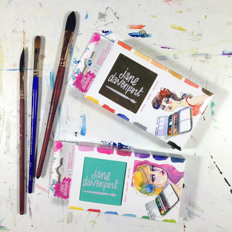
When I began seeing posts earlier this year in my social media circles about a new Jane Davenport line of mixed media materials my interest was peaked. I had to see what all of the excitement was about. She had released a whole line of supplies including two sets of watercolour pans, one called Neutral and one Brights. Unfortunately, our local Michaels stores didn’t have them in stock. In hindsight, this was a good thing because it gave me the impetus I needed to do some research first.
I have to admit that I fell in love with the tins straight away. I mean, they are so tiny and cute! And just look at this packaging! But on a serious note: In Canada, I have not found empty tins let alone ones filled with watercolours or even empty pans. Some supplies are just not available here and it seems those are often the ones I am looking for. For a country this big you would think a simple watercolour tin could be found. Then again, the whole population could fit into the state of California and not all of us are artists sooo…
These tins may be cute but I was skeptical when I found the product line at Michaels. The display was located in the scrapbooking section of the Michaels stores and not the art section. If I was going to purchase these cuties I needed to go beyond the hype so I did a lot of online searching for lightfastness ratings and all-around quality. I wanted to know exactly what I would be spending my money on.
This information wasn’t as easy to find as I expected it to be at first (but I am sure there is more out there now that these products have been on the shelves for a couple of months). There is a lightfastness rating on Jane’s site but it doesn’t tell you if one star (*) is Excellent and three (***) is fugitive and so on. I also wondered what colours these really were as the names associated with them on her site are wonderfully imaginative and fun names but do they, for example, compare to New Gamboge or a Phthalo Blue? I also didn’t want to buy colour I already had for the most part. I geeked out and compared the pigments to a list of colour names. This list breaks down the pigments into common names and the lightfastness and toxicity and more. It was very interesting. Of course, this is a guide because these ratings can change depending on the brand and other variables but it was a good place to start.
Why was I being so picky about all this?? I sell my art and I really don’t want my paint colours to fade. If I did buy these would they be the quality of artist paints or for personal use only? The latter is what I expected but wanted to know for sure as it seemed everyone was getting a set. Okay, maybe not everyone but you know…
After much research I did purchase them as you can see. I’ll have more on my results in a moment but first I must digress a bit. These tins are reeaallly tiiiinny and darn cute. Have I already said that? Even the packaging is eye-catching. Good marketing, right?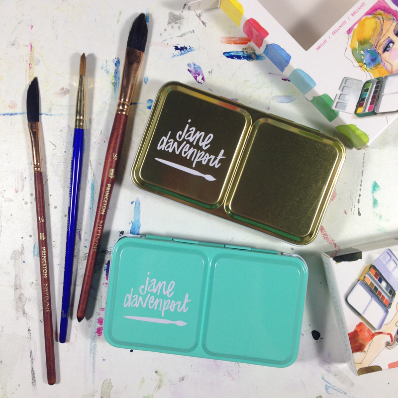 Upon opening them I noticed that one of the lids lay flatter than the other. And when I closed one of the tins it didn’t stay closed but kept popping open. I had to bend the metal a bit (gently, gently) to get it to latch and not pop open. Not a big deal but for all the hype on these babies I was a bit disappointed on that matter. Maybe I am just fussy because I think any product that is on the market should work well.
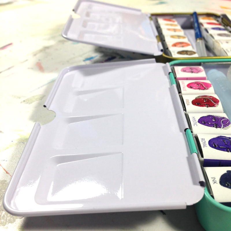 The tins are sooo tiny (I know I keep saying that!) that even my travel Winsor & Newton and Koi brush don’t fit. No big deal really but it gives you an idea of their size. They also come with a great little introduction to the paints on one side and a spot to add your swatches on the other. Nice touch. 😉
 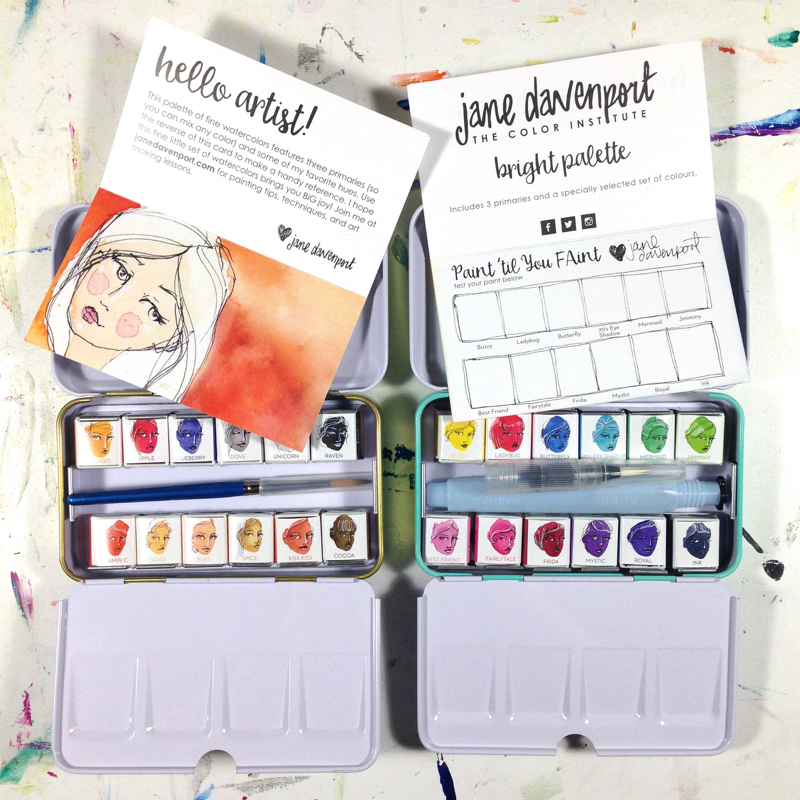 These paper inserts are not the best if you really want to see what the colours will look like on watercolour paper. To remedy that I just simply cut out little watercolour paper squares and stuck them on the inserts. Sometimes I am just simply baffled by my resourcefulness.
I also wanted to if any of the colours stain so I painted each square and then used a tissue to lift off the bottom half of the paint while still wet. The results are clear. Sometimes you want staining, sometimes you don’t. That’s all up to you but there you have it. 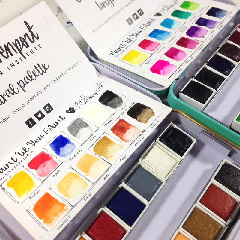 And see how easily these tins fit into your hand?!
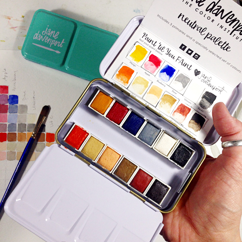 Here is a bottom view. You can see the little metal loop for your finger to make holding the tin that much easier. Sorry about the scary big hand and my nasty cuticles. That’s called winter dry season here in Canada.
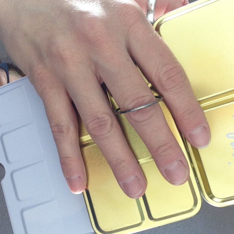 Back to the research. Instead of going into the details of all of my findings, which took many hours, I managed to dig up some great videos with excellent information on these babies from artists who regularly review paints in depth and clearly know their stuff. That’s the kind of information I wanted. Here are some links for you so you don’t have to ‘run around’ the inter web like I did. You’re welcome. 🙂
The Spin Doctor review part 1 and part 2. These posts go into detail on the paint pigments and compare to your standard pigment names and quality.
The Spin Doctor You Tube review. And this one too on Neutrals.
I also found this You Tube review by The Frugal Crafter very informative. This is a longer video but worth watching as Lindsay compares these paints, in depth, to others of similar quality.
I bought the paints! Obviously I did as I have shown you pictures of them! If you don’t want to watch these videos let me just say a bit of what I found out. These paints ARE NOT artist quality paints and are not the best for lightfastness so do not paint something and then sell it to someone. They will be sad when some of the colours fade. For more detail on that you should watch these videos above or read the links as this blog post is already lengthy. (sorry!)
All in all, I was happy to find a lot of positive reviews. These paints rewet very well and mix easily and the colours are gorgeous. They also compare nicely to other good quality student paints. I’m not sure how I feel about the ‘grey’ Dove hue, however. I love doves but I am not so keen on the grittiness of this one.
I bought these paints to use in my art journal and just for fun because the colours are lovely and sometimes I just don’t want to mix colours! Plus, the tins are a great size as I’ve already noted at least a few times so they are very portable. Just remember to stash a brush of some sort somewhere else before you leave those with your paints!
I am not finished quite yet though!
I made some lovely swatches so I could see some of the colours I would get by mixing two together. These mixes are of course by mixing about the same amount of each to get a ‘middle hue’. I made my own chart based on this one on Jane’s site because I wanted to paint on watercolour paper and my laser printer doesn’t like watercolour paper. The single colours are the ones on the diagonal. This is explained more in the attached link.
Just look at all of the lovely colours you can get from these sets! I love them!
Pictured below is my Brights set. They sure are nice and bright!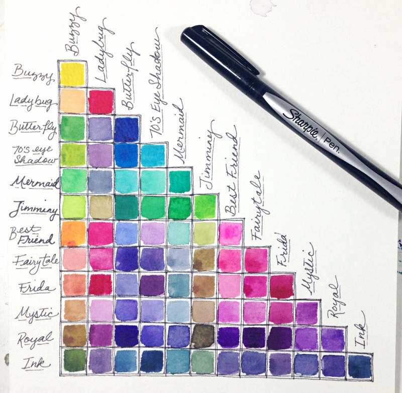 And next is my Neutrals set. Ahhhhh…calming colours..
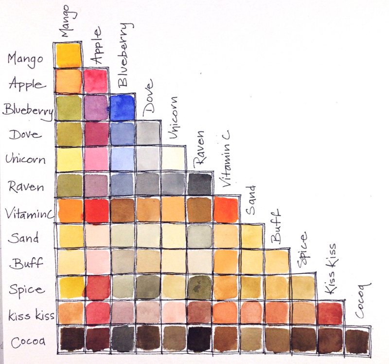 I had such a great time making those charts that I even did if for my travel W&N set. So fun!
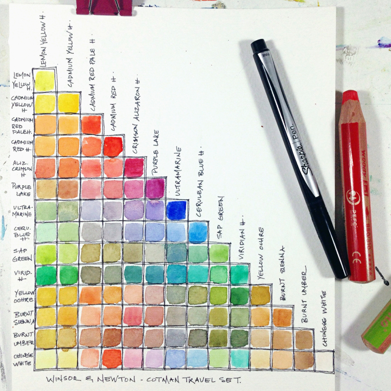
So there you have it! I hope this post will spare you some time to paint or go out and get these sets (if you haven’t already or feel that they would be a good addition to your art supplies) instead of surfing the internet looking for answers to your questions. If anything, you will gain some golden nuggets about paint pigments that you perhaps hadn’t stumbled upon before. ? There is always something more to learn, right? I am a strong believer in that.
I’d love to hear what you think of these paints too whether it be as a comment or link to your own post.
Happy creating and thanks for stopping by!
Moongirl ❤ ❤ ❤
Great review….or should I say……great, now I have to go to Michael’s…..lol Thanks for the info! (you can never have too many art supplies!)
Haha, thanks, I get that! I’m both a good and bad influence with this post. 😉
Thank you for sharing your experience with these paints.
I like using artist quality everything just in case it turns out wonderful and in case someone wants to buy it. I think all watercolors fade if they are in a place where sunlight will touch it. The colors do look wonderful.
So true about colours fading in light. I try to encourage people to not hang pieces in direct light. I hope they don’t because it is sad when colours fade. 🙁 I purchased the JD paints for when I just want to sketch for fun in my journal or small books as practice. Then I am not using my more expensive paints. But I get what you are saying because you just never know when you may create something amazing! And you do! ❤
Good review, Thank you. 🙂
With that said I’m still confused. I want to know the actual color names for the colors, it would make life much easier for me. I tried looking up the pigments but I can’t figure it out. Is there anywhere I can get this info? I’ve googled without real concrete results. I have all 3 of her kits and very happy with them…I’ve added 6 more half pans to each kit to really round out the colors, nothing much I can’t paint with this.
Will using UV resistant clear coat or putting my paintings in UV resistant page holders help with the colors/pigments that are “fugitive”?
Thank you
Joshua
Hi Joshua!
Thank you for your comments! You may have already visited the links in the post but if not…there is a link to The Spin Doctor’s reviews Part 1 and 2 which give the colours of some of the pigments used. His review gives a good idea of what some of the colours are. If you want to find out specifically what each pigment is, there is a link for a ‘list of colour names’ in the middle of the paragraph below the first image. You can take the codes that are listed for each of Jane’s colours (she has them in her website shop for those sets and The Spin Doctor lists them as well) and find them separately in the ‘list of colour names’ link. It drove me crazy at first that Jane’s paints were not typical colours that I could name but knowing the pigment names helped me understand the nature of the specific colours and their lightfastness. The colours for these kits are a mixture of pigments that Jane has trademarked with her own names so you will not find them in another brand (and they are not your typical colour mixes).
These paints are marketed for journalling. If you are using these for fun and in a journal that remains closed and out of the light when not in use, the colours should last for a while. Truthfully, I do not use any protective sprays on my watercolours as I don’t want to take the chance of the colour of the paper or paint changing colour as can happen in some instances. You could try a test by adding some paint to paper (whatever surface you would normally use these paints on) and put a protective coat on and see over time (a month or two?) how the paint reacts in sunlight or even just in a bright room (or a book). I have not tried this as I only intend to use these paints for fun in a journal or sketchbook. When I do make a painting with these sets that I particularly love I offer prints instead of the original as I would hate to sell something that may fade or have the colour change over time. For my original art that I sell I use professional grade paints that have a high lightfast rating. I would be a bit skeptical about putting paintings in page holders of any kind unless you can find ones that are archival (and UV as you mention). Depending on the humidity levels, the paper/paint may stick to the plastic over time so I would be aware of that.
I know this was a bit of long response but I hope it helps!
Joshua, — If you don’t feel like watching a video, I have a review on my blog which provides information on the pigments.
Moongirl — Love your beautiful swatch charts, and the idea to stick watercolor paper onto the inserts!
I have never used a printer that would print onto watercolor, but what magic that would be! Perhaps someday… 🙂
Thank you, Kait! 🙂